

Your Ring Is Blue. Your Wedding Doesn’t Have to Be.
Your Ring Is Blue. Your Wedding Doesn't Have to Be.
You’ve saved the peach flowers, deep blue table linen and sapphires, the colour story can feel less like a palette and more like a puzzle. A blue stone can sit beautifully beside a soft, warm scheme, and still feel as if it belongs to a different wedding.
That tension is understandable. An engagement ring is worn every day, long after the flowers have faded and the linen has been returned. It should not be treated as one more swatch to match. The question is not whether blue “goes” with peach, but how much of that blue you want to borrow, and where.
This guide looks at the practical places where a ring’s colour can appear in a wedding — and the places where it does not need to — so you can keep the stone you love without redesigning the day around it.
Decide what you actually want to borrow
Start by naming the shade, not just the colour. A cornflower blue, a deep navy and a pale aqua are all “blue”, but they behave very differently beside peach, blush or ivory. Hold the ring beside your fabric samples in daylight, then again in the evening light you expect at the venue. If the stone still reads as itself in both, you have a shade you can work with; if it disappears or shouts, you have learned something useful before any orders are placed.
Next, decide how visible you want that shade to be. A single echo — a sapphire in the bouquet ribbon, a blue thread in the stationery, a pair of shoes — can be enough to make the ring feel considered. A full blue tablescape is a different decision, and it should be made because you love blue at scale, not because the ring happens to be blue.
For many couples, the ring itself sets the terms. In Lily Arkwright’s collection of radiant-cut gemstone settings, Lively pairs a lab-grown blue sapphire with 18ct yellow gold. The warmth of the metal softens the stone, so the ring reads as jewellery first and as a colour statement second. That is a useful test for any setting: does the metal help the stone sit comfortably with the rest of your look, or does it make the colour harder to place?
Choose one place to echo the shade, and let the rest of the palette do its own work. A ring does not need a matching bridesmaid dress to feel intentional.
Give the room a say
A venue will pull a colour in one direction or another. A room with warm wood, candlelight and cream walls will make a blue stone look deeper and more formal. A bright, white space with large windows will make the same stone look lighter and more casual. Visit the room, if you can, with the ring on, and notice whether the stone feels like part of the scene or like an interruption.
Flowers and linen are the easiest places to test that feeling. A peach rose beside a blue sapphire can look fresh rather than clashing, because the two colours sit on opposite sides of the colour wheel and each makes the other look more itself. A deep blue linen, on the other hand, can swallow a pale stone and make the table feel heavier than you intended. Ask your florist to put one stem beside the ring, and your linen supplier to show you the fabric in the room’s light, before you commit to either.
If the room already has a strong colour — a painted wall, a patterned carpet, a garden in full bloom — let it lead. The ring can be a private detail in that setting, rather than a colour the whole room has to accommodate.
Use a real shade, not just a colour name
Colour names are unreliable. “Sapphire blue” can mean a vivid cornflower, a dark navy or a grey-blue that barely reads as blue at all. When you talk to suppliers, bring the ring, or a photograph of it in daylight, rather than relying on the word alone. A swatch that matches the name may not match the stone, and a swatch that looks wrong on its own may be exactly right beside the metal.
It helps to know what you are looking at. The GIA’s sapphire colour guidance explains how hue, tone and saturation work together, and why two stones described as “blue” can look so different. You do not need to become a gemmologist, but knowing whether your stone is light or dark, vivid or muted, will make every colour conversation with a supplier shorter and more accurate.
Keep a note of the shade you have — a photograph in daylight, the metal colour, and one word for how vivid it feels — and share that note, not just the word “blue”, with anyone choosing flowers, linen or stationery.
Try the jewellery with the clothes
A ring is worn with an outfit, not with a mood board. Try it with the dress, the suit, the shoes and the coat you expect to wear, and look at the whole picture in a mirror, not just at your hand. A blue stone can look striking against a white dress and almost invisible against a dark suit; a yellow-gold band can warm up a cool palette in a way a white metal would not.
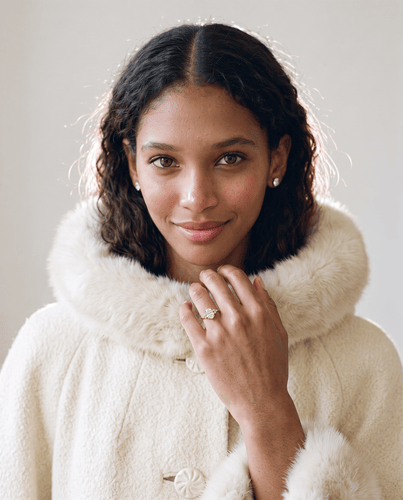
Photograph the combination in the light you will actually be in — daylight for the ceremony, warmer light for the evening — and check the photographs, not just the mirror. Cameras pick up colour contrasts that eyes smooth over, and a photograph will show you whether the ring is a quiet detail or the first thing anyone notices.
If the jewellery and the clothes are pulling in different directions, change the clothes’ accessories, not the ring. A different shoe, a warmer wrap or a simpler bouquet can bring the whole look together without asking the stone to be something it is not.
For another way to think about the clothes, see You’re The Bride’s wedding-style feature.
Tell your planner where the connection stops
Once you have decided how much of the ring’s colour to echo, say so plainly. “One echo, in the bouquet ribbon, and nowhere else” is a clearer brief than “something blue”, and it stops well-meaning suppliers from adding blue to the cake, the chairs and the confetti. A planner can only protect a decision they know about.
Write the decision down where everyone can see it — in the planning document, not just in a conversation — and name the shade, the place and the limit. That note is what keeps a small, thoughtful echo from becoming a theme you never chose.
Your ring is blue. Your wedding does not have to be. Let the stone be a detail you love, borrow its shade once if you like, and let the rest of the day be the colours you would have chosen anyway.
FAQ’s About Saint John’s Resort Weddings
Q. Is Saint John’s Resort a good wedding venue? Yes, Saint John’s Resort is one of the most elegant wedding venues in Metro Detroit.
Q. Do couples hire wedding planners for Saint John’s Resort? Many couples choose a planner familiar with the venue to help coordinate timelines, vendors, and event logistics.
Q. What are the dining options at St. John’s Resort? Five Steakhouse, Doyle’s Irish Pub and The Wine Grotto. Great for on-site rehearsal dinners.